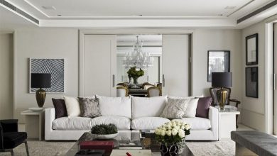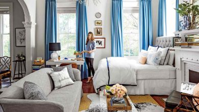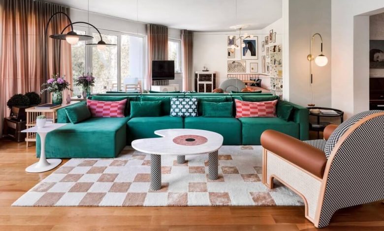
The prevailing trend of monochromatic, neutral-drenched interiors has left many homes feeling undeniably serene, yet strangely devoid of character. When every room is awash in endless variations of griege, off-white, and pale oak, living spaces begin to resemble generic rental stages or hotel lobbies rather than personal sanctuaries. While a neutral foundation provides a calming backdrop and architectural flexibility, it requires contrast to truly come alive. Without intentional focal points, the human eye wanders across a room without landing anywhere in particular, resulting in a flat, uninspiring environment.
Introducing accent colors is the most reliable way to inject vitality, emotional depth, and individuality into your home. Yet, many homeowners hesitate to take the leap, paralyzed by the fear of choosing an overwhelming shade or creating a chaotic, mismatched palette. Effective color design is rarely about splashing vibrant hues across an entire room without restraint. It is a disciplined study in proportion, undertone balance, and strategic placement, designed to guide the eye and reflect how you actually want to feel within your space.
Grounding Color Theory: The 60-30-10 Framework and Visual Weight
The most dependable starting point for any color palette is the time-tested 60-30-10 rule. This design ratio functions as a compositional framework that keeps contrasting shades from competing with one another.
Under this model, sixty percent of the room represents your dominant base color. This encompasses large structural planes: primary wall paint, main flooring surfaces, and large foundational furniture pieces like a sectional sofa. Thirty percent belongs to your secondary color, which provides depth and supports the primary base. This is typically expressed through area rugs, window drapery, accent chairs, or built-in cabinetry. The final ten percent is reserved for your high-impact accent color—the deliberate, saturated, or contrasting hue that commands attention across art, tabletop ceramics, lighting, and textiles.
However, mechanical adherence to percentages can fail if you ignore the concept of visual weight. Not all colors carry equal gravitational pull in an interior. A soft, muted sage green occupies space gently, allowing you to use it across larger surfaces without visual fatigue. Conversely, a deeply saturated cobalt blue, ochre yellow, or rich terracotta carries tremendous visual weight. A small, intentional touch of a potent hue—such as an enameled decorative bowl or a single velvet armchair—often delivers the same visual punch as an entire wall painted in a paler secondary tone.
Reading Your Architecture: Matching Accents to Existing Undertones
Before selecting paint chips or ordering decorative textiles, you must read the fixed architectural elements already present in your home. Hardwood floors, natural stone countertops, brick fireplaces, and tile work represent permanent investments that cannot be swapped out easily. Every one of these elements carries an underlying temperature:
-
Warm architectural foundations: Honey-toned red oak floors, cream-colored travertine, unlacquered brass hardware, and warm limestone naturally harmonize with earthy, warm-spectrum accents. Terracotta, olive green, burnt amber, and rich mustard complement these bases effortlessly.
-
Cool architectural foundations: White ash flooring, carrara marble, polished chrome, and slate carry cool blue or gray undertones. These materials respond exceptionally well to crisp accents like spruce green, deep navy, rich plum, and muted indigo.
You can approach your accent strategy through two distinct philosophies: analogous harmony or complementary tension. An analogous scheme chooses an accent color that sits directly adjacent to your secondary tones on the color wheel, such as pairing deep forest green accents within an olive and beige living room. This creates a tranquil, cohesive mood. A complementary scheme, by contrast, introduces a color from the opposite side of the wheel—such as pairing rust-orange velvet pillows against deep navy cabinetry—generating vibrant dynamic energy and crisp visual contrast.
High-Impact Placement Strategies Beyond Throw Pillows
When homeowners think of accent colors, their minds almost exclusively gravitate toward inexpensive throw pillows and cheap decorative throws. While soft textiles certainly have their place, relying solely on small cushions often results in an afterthought look, where isolated splashes of bright color feel disconnected from the room’s physical structure. Elevating your home requires integrating accent color directly into the architecture.
Architectural Envelopes and Interior Doors
One of the most sophisticated ways to introduce saturated color without overwhelming a room is by treating architectural millwork as a canvas. Instead of painting all interior doors and baseboards basic semi-gloss white, coat them in a rich, velvety accent hue. Painting an interior passage door in deep charcoal, sage, or dark aubergine frames movement throughout the home and immediately signals elevated craftsmanship.
Similarly, running an accent color across vertical beadboard, picture-frame molding, or window casings grounds the eye, turning structural boundaries into intentional design statements.
Kitchen and Built-In Millwork
Kitchens and home libraries are prime territory for high-character accenting. If an entire room enveloped in saturated color feels intimidating, use millwork to isolate the hue:
-
The kitchen island base: Keep perimeter cabinetry in a classic neutral cream or wood tone, while painting the central island base in a bold, grounded tone like hunter green or slate navy.
-
Bookcase interior backing: Paint the recessed back wall of open bookshelves in a dark, moody accent color. This simple trick adds dramatic shadow depth and creates a rich backdrop that makes books and ceramic accessories stand out sharply.
-
Pantry and pocket doors: A sliding barn door or swinging pantry door finished in a contrasting high-gloss lacquer serves as functional, dynamic wall art.
Statement Lighting and Art Curation
Lighting fixtures are frequently overlooked as color conduits. A pair of pendant lights finished in matte terracotta ceramic or powder-coated matte green over a kitchen counter adds instant personality without consuming valuable floor or wall real estate.
When choosing wall art, avoid generic prints that simply pull the exact colors of your sofa into a frame. Fine art should introduce tension. A large canvas featuring an unexpected splash of citrine or persimmon can become the single unifying element that pulls disparate room colors into conversation, serving as the visual anchor for the entire space.
Establishing a Unified Palette Across Connecting Rooms
A common failure in residential color design is the carnival-room effect, where every bedroom and living space boasts an entirely separate, unconnected color theme. Stepping from a bright yellow kitchen into an electric blue living room creates visual dissonance and destroys the perceived flow of a floor plan.
In modern open-concept and transitional homes, establish a color thread—a central leitmotif that travels gently from room to room. Rather than introducing five new colors in every space, select a cohesive family of three to four tones and alter their proportional hierarchy as you move through the house:
-
In the living room, a rich olive green might serve as the subtle ten-percent accent through a pair of table lamps and a wool throw, supported by ninety percent neutrals.
-
As you transition into the dining room, that same olive green can expand to thirty percent, taking over the upholstery of the dining chairs or the wallpaper pattern.
-
In a small powder room or study, flip the formula completely: let the olive green envelop sixty percent of the room via saturated wall paint, supported by warm brass and crisp linen accents.
This intentional rotation creates distinct moods for individual rooms while preserving an overarching sense of continuity throughout the home.
The Decisive Influence of Natural and Artificial Light
A color never exists in isolation; it exists entirely as a reflection of the light striking its surface. A rich ochre that looks warm and inviting in a sunny southern exposure can turn dull, muddy, and sickly in a windowless hallway.
Always evaluate your accent colors under both natural daylight and your evening artificial lighting:
-
Northern exposure: North-facing rooms receive cool, bluish daylight that softens pigments and dampens warmth. In these spaces, avoid cool-toned gray-greens or icy blues, which will read cold and clinical. Instead, choose rich, warm-based accents with yellow or red undertones to inject artificial warmth.
-
Southern exposure: South-facing rooms are blessed with intense, golden daylight throughout the day. These rooms can easily handle deeply saturated jewel tones, crisp blues, and rich charcoals without feeling dreary.
-
Kelvin temperature calibration: Check your light bulbs before committing to paint or fabrics. Standard builder bulbs often sit around an aggressive 5000K daylight spectrum, which casts a harsh blue haze over warm accents. Swap your fixtures to 2700K to 3000K warm-white LED bulbs. This warm spectrum enhances natural wood tones, flatters skin tones, and allows saturated accent colors to glow with natural warmth after sundown.
Using accent color is not about chasing fleeting decorative trends or completely abandoning the peaceful security of neutrals. It is an intentional tool for storytelling, visual balance, and architectural emphasis. By respecting the natural undertones of your home, distributing color with structural restraint, and allowing your lighting to do the heavy lifting, you can craft a home interior that feels curated, deeply personal, and completely your own.